Ready for a deep-dive into the exciting realm of data interpretation ? 📊 Today, Multi-Variate Regression is on the menu. Sounds complex ? Well, by the time we’re done, it’ll feel like a walk in the park 🌳🚶♂️
We’ll be looking at how to train a Multi-Variate Linear Regression model, demystifying those complex mathematical equations, and transforming them into simple, understandable concepts. And the best part ? We’ll be visualizing our results, turning abstract numbers into vibrant, understandable graphics 📈
Buckle-up because we’re about to roll up our sleeves and dive into implementing Multi-Variate Linear Regression from scratch using Pytorch 💪
If you haven’t read the previous article of this series, feel free to explore it !
The Dataset: CarDekho
In this study, we will be using the CarDekho dataset by trying to predict car prices. The dataset contains the following features 🔬:
the name of the car
the year it was released
the selling price
the present price
the number of kilometers driven
the type of fuel used (petrol or diesel)
the transmission type (manual or automatic)
the number of times the car has changed hands
Each of these factors significantly contributes to a car’s price, and we will use this data to build a predictive model 🤖
Exploratory Data Analysis
Exploratory Data Analysis (EDA) is a critical preliminary step that involves summarizing the main characteristics of a dataset through visual methods or statistical summaries 📊
It is essential for Machine Learning as it allows us to understand the underlying structure of the data, identify outliers, discover patterns, and test assumptions using powerful visual or quantitative methods, thus providing valuable insights for building efficient and accurate predictive models 🧠💡
First let’s import the necessary packages:
import osimport sysimport torchimport pandas as pdimport numpy as npimport seaborn as snsimport statsmodels.api as smimport matplotlib.pyplot as pltfrom sklearn.model_selection import train_test_split
Now let’s read the data into a Pandas dataframe. You can download the dataset with this Kaggle link.
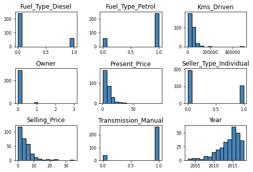
Let’s visualize the individual feature distributions to understand the range, central tendencies, and spread of our data, which in turn helps us identify any skewness, outliers, or anomalies that could impact our model’s performance 📈🔎
For these bar plots, we can see that most cars on sales are:
consuming petrol instead of diesel
had only one owner
are from the 2012-present time range
are manual
sold between 1 and 10, 100 000 Indian Rupees
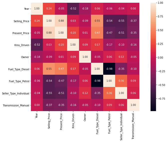
Heatmap correlation
Let’s introduce our most colorful friend: the Heatmap Correlation ! 🌈 It is a graphical representation that showcases the correlation or relationship between different variables or features in a dataset using color-coded cells.
When two variables are highly correlated, they exhibit a value close to 1 (or -1 for inverse correlation), while a value near 0 indicates a lack of correlation between the variables.
A Heatmap Correlation, in machine learning, help us understand the relationships and dependencies between different features, thus providing a way to identify patterns and make informed decisions during the model-building process 🔧
<matplotlib.axes._subplots.AxesSubplot at 0x1f5bb762b08>
The correlation between the variables and the selling price is the most useful information for us as it is what we want to predict 🚗💵
Most variables have a strong correlation, except for kilometers driven and number of owners, which are less connected. We could have deleted them, but since they matter in car-buying decisions, we’ll keep them in our analysis 🔍
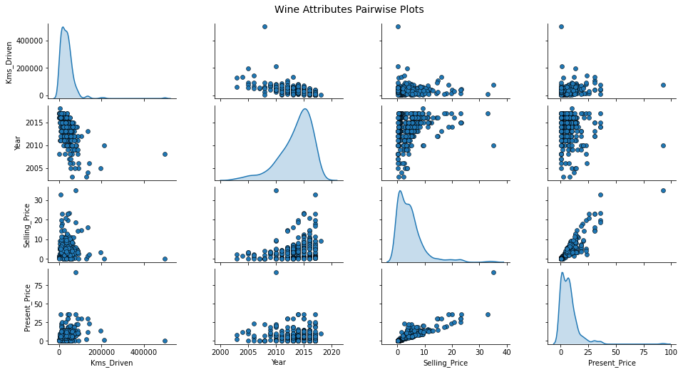
Pairwise Plots
A pairwise plot, displays a grid of scatter plots, where each plot shows the relationship between the distribution of two variables.
Pairwise plots are useful because they allow us to quickly assess the patterns between variables.
Here, we can see that there’s one of two outliers. An outlier is a data point deviates or differs from the majority of other data points in a dataset.
The year feature has a polynomial correlation with the selling price so a polynomial regression will most likely outperform a standard linear regression.
Instead, the present price has a linear relationship with the present price.
Model Training and Testing
Create training data partition
The train-validation-test split is a process of dividing a dataset into three distinct subsets: the training set, the validation set, and the test set.
The training set is used to train the model, the validation set is used to tune model parameters and evaluate performance during development, and the test set is used to assess the final model’s performance on unseen data.
# Separate the target from the dataFrameY = df['Selling_Price']X = df.drop('Selling_Price', axis=1)# Convert data to Pytorch tensorX_t = torch.from_numpy(X.to_numpy()).float()Y_t = torch.from_numpy(Y.to_numpy()).float().unsqueeze(1)X_train, X_test, Y_train, Y_test = train_test_split(X_t, Y_t, test_size=0.33, random_state=42)
Multi-Variate Linear Regression
Alright, it’s time to dive into some math now ! 📐
Training a linear model using least square regression is equivalent to minimize the mean squared error:
where \(n\) is the number of samples, \(\hat{y}\) is the predicted value of the model and \(y\) is the true target. The prediction \(\hat{y}\) is obtained by matrix multiplication between the input \(\boldsymbol{X}\) and the weights of the model \(\boldsymbol{w}\).
Minimizing the \(\text{Mse}\) can be achieved by solving the gradient of this equation equals to zero in regards to the weights \(\boldsymbol{w}\):
For more information on how to find \(\boldsymbol{w}\) please visit the following link.
Building the Model
Let’s build the model using Pytorch:
def add_ones_col(X):"""Add a column a one to the input torch tensor""" x_0 = torch.ones((X.shape[0],), dtype=torch.float32).unsqueeze(1) X = torch.cat([x_0, X], dim=1)return Xdef multi_linear_reg(X, y):"""Multivariate linear regression function Args: X: A torch tensor for the data. y: A torch tensor for the labels. """ X = add_ones_col(X) # Add a column of ones to X to agregate the bias to the input matrices Xt_X = X.T.mm(X) Xt_y = X.T.mm(y) Xt_X_inv = Xt_X.inverse() w = Xt_X_inv.mm(Xt_y)return wdef prediction(X, w):"""Predicts a selling price for each input Args: X: A torch tensor for the data. w: A torch tensor for the weights of the linear regression mode. """ X = add_ones_col(X)return X.mm(w)
Time to train the model 🎉
# Fit the training set into the model to get the weightsw = multi_linear_reg(X_train, Y_train)# Predict using matrix multiplication with the weightsY_pred_train = prediction(X_train, w)Y_pred_test = prediction(X_test, w)
Computing the Prediction Errors
Now let’s crunch some numbers and calculate the metric to assess our model’s performance.
MSE Train:   2.808985471725464
MAE Train:   1.1321566104888916

MSE Test:    3.7205495834350586
MAE Test:    1.2941011190414429
The model has an \(\text{Mse}\) of 3.72 on average on the test set. It means that, on average, the squared difference between the predicted values and the actual values is 3.72.
The selling price unit is in 100 000 Indian Rupee, which convert to 1 USD = 82,20 INR at the time of writing. It means that on average, the model has an approximate error of 408 USD on the test set.
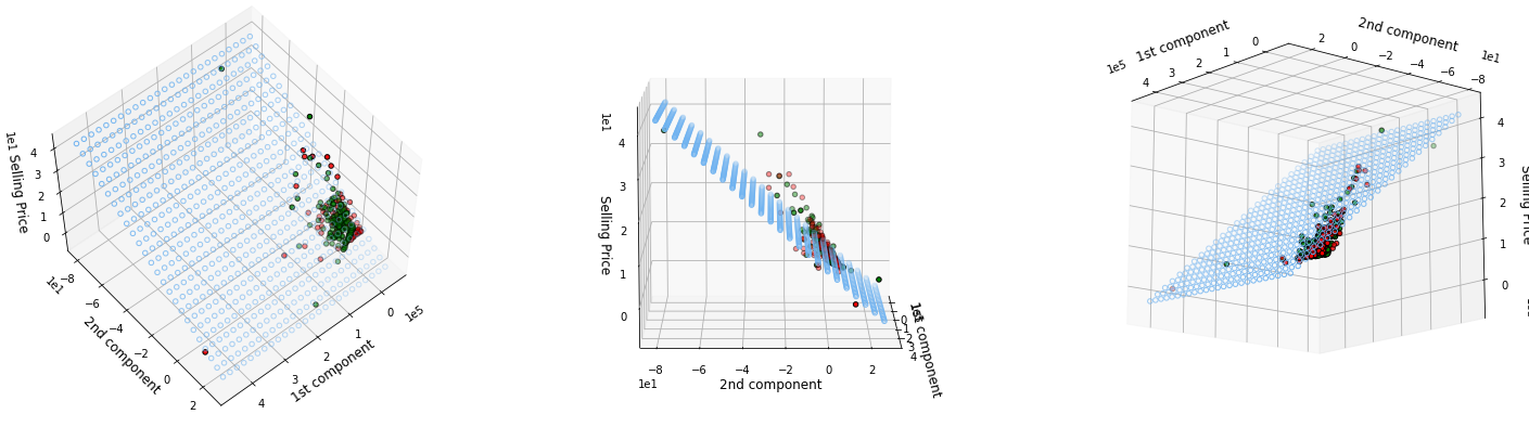
Principal Component Analysis (PCA) and 3D Visualization
In this section, we will use PCA to reduce the number of feature to two, in order to visualize the plane of the linear regressor.
Suppose a collection of \(m\) points \(\{\boldsymbol{x}^{(1)}, \dots, \boldsymbol{x}^{(m)}\} \in \mathbb{R}^n\). The principal components analysis aims to reduce the dimensionality of the points while losing the least precision as possible. For each point \(\boldsymbol{x}^{(i)} \in \mathbb{R}^n\) we will find a corresponding code vector \(\boldsymbol{c}^{(i)} \in \mathbb{R}^l\) where \(l\) is smaller than \(n\). Let \(f\) be the encoding function and \(g\) be the decoding function and \(\boldsymbol{D} \in \mathbb{R}^{n,l}\) is the decoding matrix whose columns are orthonormal: \[\begin{align}
f(\boldsymbol{x}) &= \boldsymbol{D}^\top \boldsymbol{x} \\
g(f(\boldsymbol{x})) &= \boldsymbol{D}\boldsymbol{D}^\top \boldsymbol{x}
\end{align}\]
def cov(X):"""Computes the covariance of the input The covariance matrix gives some sense of how much two values are linearly related to each other, as well as the scale of these variables. It is computed by (1 / (N - 1)) * (X - E[X]).T (X - E[X]). Args: X: A torch tensor as input. """ X -= X.mean(dim=0, keepdim=True) fact =1.0/ (X.shape[0] -1) cov = fact * X.T.mm(X)return covdef pca(X, target_dim=2):"""Computes the n^th first principal components of the input PCA can be implemented using the n^th principal components of the covariance matrix. We could have been using an eigen decomposition because the covariance matrix is always squared but singular value decomposition does also the trick if we take the right singular vectors and perform a matrix multiplication to the right. Args: X: A torch tensor as the input. target_dim: An integer for selecting the n^th first components. """ cov_x = cov(X) U, S, V = torch.svd(cov_x) transform_mat = V[:, :target_dim] X_reduced = X.mm(transform_mat)return X_reduced, transform_mat
Good news ! The prediction plane is fitting pretty well the data 😎
Conclusion
So, here’s the bottom line: EDA helped us understand some trends in our data and we managed to build a pretty decent linear regression model !
It turns out that linear regression can work like magic if your data has a lot of linear correlation.
Remember to add a linear model to your baseline for relatively regression tasks in order to compare it to more sophisticated models. Happy data exploring! 🚀📊
Still eager to learn ? You can jump right in the next article of this series on Logistic Regression.
Stay in touch
I hope you enjoyed this article as much as I enjoyed writing it!
Feel free to DM me any feedback on LinkedIn or email me directly. It will be highly appreciated.
That's what keeps me going!
Subscribe to get the latest articles from my blog delivered straight to your inbox!
About the author
Axel Mendoza
Senior MLOps Engineer
I'm a Senior MLOps Engineer with 6+ years of experience building production-ML systems.
I write long-form articles on MLOps to help you build too!