Data Insights: Top Factors For Startup Success

Discover the main factors leading to startup acquisition with our real-world dataset analysis. Learn how to explore, pre-process, analyze, and gain insights from data.
python
exploratory data analysis
Author
Published

Apr 19, 2024

Mind map of startup success factors | Source: Gabriela Arzate

Building a successful startup is difficult. Statistics show that 90% of startups fail, which leads us to wonder: what are the main factors that make successful startups?

The Startup Success Prediction dataset released on Kaggle contains information about industries, acquisitions, and investment details of nearly a thousand startups based in the USA from the 1980s to 2013.

In this article, we will explore this dataset to find data insights related to the success of startups. To extract interesting trends from data, it’s essential to understand how to transform raw data into meaningful information. To achieve this goal, we will perform the following steps:

  1. Data exploration: Investigate the data to identify what is available.
  2. Pre-processing: Organize and refine the data for better analysis.
  3. Data analysis: Study the data to identify significant trends and useful patterns.

Let’s begin by understanding some concepts related to startups.

Understanding the Startup Ecosystem

Startups raise money in stages called funding rounds, like Series A, B, or C. These rounds enable the startups to invest the necessary resources for their growth.

Startups set goals called milestones, like launching a product or getting a certain number of users. These reflect their performance to the investors.

Finally, startups secure funding from two types of sources:

  • Angel investors are individuals who provide personal capital for investment.
  • Venture capital firms are corporate entities specializing in startup investments. Now that you understand the context, let’s explore the data.

Data Exploration

Data exploration is the first step in data analysis. It involves examining datasets to identify patterns and anomalies.

First, we import the following libraries. We will use these packages for data manipulation, analysis, and visualization:

import numpy as np
import pandas as pd
import seaborn as sns
import matplotlib.pyplot as plt
import plotly.graph_objects as go
import plotly.express as px

Next, we load the data into a Pandas dataframe.

file_path = 'startup.csv'
dataframe = pd.read_csv(file_path, encoding="ISO-8859-1")

pd.set_option('display.max_columns', None)
dataframe.head(2)
Unnamed: 0 state_code latitude longitude zip_code id city Unnamed: 6 name labels founded_at closed_at first_funding_at last_funding_at age_first_funding_year age_last_funding_year age_first_milestone_year age_last_milestone_year relationships funding_rounds funding_total_usd milestones state_code.1 is_CA is_NY is_MA is_TX is_otherstate category_code is_software is_web is_mobile is_enterprise is_advertising is_gamesvideo is_ecommerce is_biotech is_consulting is_othercategory object_id has_VC has_angel has_roundA has_roundB has_roundC has_roundD avg_participants is_top500 status
0 1005 CA 42.358880 -71.056820 92101 c:6669 San Diego NaN Bandsintown 1 1/1/2007 NaN 4/1/2009 1/1/2010 2.2493 3.0027 4.6685 6.7041 3 3 375000 3 CA 1 0 0 0 0 music 0 0 0 0 0 0 0 0 0 1 c:6669 0 1 0 0 0 0 1.00 0 acquired
1 204 CA 37.238916 -121.973718 95032 c:16283 Los Gatos NaN TriCipher 1 1/1/2000 NaN 2/14/2005 12/28/2009 5.1260 9.9973 7.0055 7.0055 9 4 40100000 1 CA 1 0 0 0 0 enterprise 0 0 0 1 0 0 0 0 0 0 c:16283 1 0 0 1 1 1 4.75 1 acquired


The status variable is the most important feature of this dataset. This binary variable indicates whether a startup has been acquired or closed.

# Creating a DataFrame
df_copy = pd.DataFrame(dataframe)

df_copy['binary_status'] = df_copy['status'].map({'acquired': 1, 'closed': 0})

# Counting the occurrences of each status
status_counts = df_copy['binary_status'].value_counts()

# Show the bar plot
plt.bar(status_counts.index, status_counts.values, color=['green', 'red'])
plt.xticks([0, 1], ['Closed','Acquired'])
plt.xlabel('Status')
plt.ylabel('Number of Startups')
plt.title('Acquired vs. Closed Startups')
plt.show()

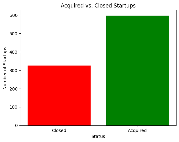
From trustworthy sources, we know that less than 10% of startups succeed. In this dataset, 597 startups were acquired, while 326 closed, resulting in a success rate of 64%. This statistic is far from the truth, most likely because the companies reported in this dataset were already successful startups.

Data Pre-processing

Data pre-processing consists of cleaning and organizing the raw data:

  • Data cleaning: This step involves identifying and correcting errors, such as typos, duplicates, or incorrect entries. It is essential for maintaining data integrity. We will pay particular attention to:
    • The irrelevant features.
    • The missing values.
    • The negative values where it shouldn’t be so.
  • Data transformation: Modifies data to re-organize them into a format appropriate for performing analysis. These are the common transformations we will perform:
    • Normalization and standardization: These techniques adjust data to a common scale, making it easier to compare them.
    • Encoding categorical data: Map categorical variables to integers.

Handle Irrelevant Features

An irrelevant feature is a variable that is not meaningful for the task. Eliminating irrelevant variables simplifies the analysis process. It ensures that we focus on meaningful factors by reducing unnecessary information and improving clarity in data exploration.

To start dropping variables, let’s analyze the details contained in each feature.

dataframe.head()
Unnamed: 0 state_code latitude longitude zip_code id city Unnamed: 6 name labels founded_at closed_at first_funding_at last_funding_at age_first_funding_year age_last_funding_year age_first_milestone_year age_last_milestone_year relationships funding_rounds funding_total_usd milestones state_code.1 is_CA is_NY is_MA is_TX is_otherstate category_code is_software is_web is_mobile is_enterprise is_advertising is_gamesvideo is_ecommerce is_biotech is_consulting is_othercategory object_id has_VC has_angel has_roundA has_roundB has_roundC has_roundD avg_participants is_top500 status
0 1005 CA 42.358880 -71.056820 92101 c:6669 San Diego NaN Bandsintown 1 1/1/2007 NaN 4/1/2009 1/1/2010 2.2493 3.0027 4.6685 6.7041 3 3 375000 3 CA 1 0 0 0 0 music 0 0 0 0 0 0 0 0 0 1 c:6669 0 1 0 0 0 0 1.0000 0 acquired
1 204 CA 37.238916 -121.973718 95032 c:16283 Los Gatos NaN TriCipher 1 1/1/2000 NaN 2/14/2005 12/28/2009 5.1260 9.9973 7.0055 7.0055 9 4 40100000 1 CA 1 0 0 0 0 enterprise 0 0 0 1 0 0 0 0 0 0 c:16283 1 0 0 1 1 1 4.7500 1 acquired
2 1001 CA 32.901049 -117.192656 92121 c:65620 San Diego San Diego CA 92121 Plixi 1 3/18/2009 NaN 3/30/2010 3/30/2010 1.0329 1.0329 1.4575 2.2055 5 1 2600000 2 CA 1 0 0 0 0 web 0 1 0 0 0 0 0 0 0 0 c:65620 0 0 1 0 0 0 4.0000 1 acquired
3 738 CA 37.320309 -122.050040 95014 c:42668 Cupertino Cupertino CA 95014 Solidcore Systems 1 1/1/2002 NaN 2/17/2005 4/25/2007 3.1315 5.3151 6.0027 6.0027 5 3 40000000 1 CA 1 0 0 0 0 software 1 0 0 0 0 0 0 0 0 0 c:42668 0 0 0 1 1 1 3.3333 1 acquired
4 1002 CA 37.779281 -122.419236 94105 c:65806 San Francisco San Francisco CA 94105 Inhale Digital 0 8/1/2010 10/1/2012 8/1/2010 4/1/2012 0.0000 1.6685 0.0384 0.0384 2 2 1300000 1 CA 1 0 0 0 0 games_video 0 0 0 0 0 1 0 0 0 0 c:65806 1 1 0 0 0 0 1.0000 1 closed


In this code block, we remove features that are not important and explain the main reasons.

dataframe = dataframe.drop([
    'Unnamed: 0',      # Not useful for our analysis. 
    'latitude',        # Not useful for our analysis. 
    'longitude',       # Not useful for our analysis. 
    'zip_code',        # Not useful for our analysis. 
    'id',              # Not useful for our analysis. 
    'name',            # Not useful for our analysis. 
    'Unnamed: 6',      # Not useful for our analysis. 
    'object_id',       # Not useful for our analysis. 
    'labels',          # Information already included in "status" column.
    'state_code.1',    # Information already included in "state" column.
    'is_CA',           # Information already included in "state" column.
    'is_NY',           # Information already included in "state" column.
    'is_MA',           # Information already included in "state" column.
    'is_TX',           # Information already included in "state" column.
    'is_otherstate',   # Information already included in "state" column.
    'is_software',     # Information already included in "state" column.
    'is_web',          # Information already included in "state" column.
    'is_mobile',       # Information already included in "state" column.
    'is_enterprise',   # Information already included in "state" column.
    'is_advertising',  # Information already included in "state" column.
    'is_gamesvideo',   # Information already included in "state" column.
    'is_ecommerce',    # Information already included in "state" column.
    'is_biotech',      # Information already included in "state" column.
    'is_consulting',   # Information already included in "state" column.
    'is_othercategory',# Information already included in "state" column.
], axis=1).copy()

We’ve simplified the dataframe from 50 columns to 24.

dataframe.info()
<class 'pandas.core.frame.DataFrame'>
RangeIndex: 923 entries, 0 to 922
Data columns (total 24 columns):
 #   Column                    Non-Null Count  Dtype  
---  ------                    --------------  -----  
 0   state_code                923 non-null    object 
 1   city                      923 non-null    object 
 2   founded_at                923 non-null    object 
 3   closed_at                 335 non-null    object 
 4   first_funding_at          923 non-null    object 
 5   last_funding_at           923 non-null    object 
 6   age_first_funding_year    923 non-null    float64
 7   age_last_funding_year     923 non-null    float64
 8   age_first_milestone_year  771 non-null    float64
 9   age_last_milestone_year   771 non-null    float64
 10  relationships             923 non-null    int64  
 11  funding_rounds            923 non-null    int64  
 12  funding_total_usd         923 non-null    int64  
 13  milestones                923 non-null    int64  
 14  category_code             923 non-null    object 
 15  has_VC                    923 non-null    int64  
 16  has_angel                 923 non-null    int64  
 17  has_roundA                923 non-null    int64  
 18  has_roundB                923 non-null    int64  
 19  has_roundC                923 non-null    int64  
 20  has_roundD                923 non-null    int64  
 21  avg_participants          923 non-null    float64
 22  is_top500                 923 non-null    int64  
 23  status                    923 non-null    object 
dtypes: float64(5), int64(11), object(8)
memory usage: 173.2+ KB

Here’s a description of the essential features:

  • state_code: The state where the startup is located.
  • city: The city where the startup is located.
  • founded_at: The startup’s creation date.
  • closed_at: The date when the startup was closed, if applicable.
  • relationships: The number of key business relationships or partnerships the startup has.
  • funding_rounds: The total number of funding rounds the startup has gone through.
  • funding_total_usd: The total funding the startup has received in USD.
  • milestones: Total number of significant achievements or events in the life of a startup.
  • category_code: The primary field of the startup’s business. Like software, music, and so on.

Missing Values

Missing values are data points in a dataset where information is not recorded for a specific variable.

It is important to handle missing values to preserve the integrity of your dataset. Without proper handling, null values can lead to errors or misleading results during statistical analyses.

x = dataframe.isnull().sum()
missing_values = x[x > 0].sort_values(ascending=False)
print(missing_values)
closed_at                   588
age_first_milestone_year    152
age_last_milestone_year     152
dtype: int64

Handling null values varies based on data characteristics and analysis goals. The chosen method should be specific to each case.

As shown above, we’ve identified three features that contain missing values.

Given that age_first_milestone_year and age_last_milestone_year are continuous numerical variables, our chosen imputation method will involve filling the missing values with the respective means for these variables.

dataframe["age_first_milestone_year"] = dataframe["age_first_milestone_year"].fillna(
    dataframe["age_first_milestone_year"].mean()
)
dataframe["age_last_milestone_year"] = dataframe["age_last_milestone_year"].fillna(
    dataframe["age_last_milestone_year"].mean()
)

The missing values in closed_at represent startups that are still open and will not be replaced for now. This approach preserves the information that certain startups are still active without arbitrarily assigning a closure date.

Now that we’ve handled missing values, let’s proceed with the negative values.

Negative values

Negative values can be important indicators, especially in financial data where they often represent debt or losses. Removing them without careful consideration could result in missing critical information.

However, negative numbers might indicate errors. Thus requiring changes to the data.

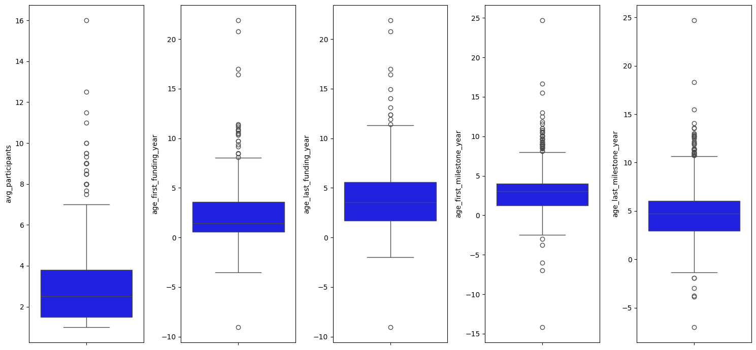
To find negative values, we’ll use box plots. Box plots make it easy to spot negative values that could be mistakes or unusual data.

According to our data set, most of the features are binary which are not suitable for negative values detection. Therefore we will consider only the following continuous variables.

continuous_variables = [
    'avg_participants',
    'age_first_funding_year',
    'age_last_funding_year',
    'age_first_milestone_year',
    'age_last_milestone_year'
]
plt.figure(figsize=(15, 7))
for i in range(0, len(continuous_variables)):
    plt.subplot(1, len(continuous_variables), i + 1)
    sns.boxplot(y=dataframe[continuous_variables[i]], color='blue', orient='v')
    plt.tight_layout()

The main observations are:

  • In box plots 2, 3, 4, and 5, we observe negative values extending below the zero line on the y-axis.
  • The points lying above the upper whisker represent the positive outliers. We will address these in a later stage of our analysis.

Let’s see how two variables are connected using scatter plots. These visualizations help us see the connection between two variables, making it easier to find unusual data points or negative values.

def negative_values_detection(dataframe):
    def convert_to_datetime(dataframe, columns):
        for col in columns:
            dataframe[col] = pd.to_datetime(dataframe[col])

        dataframe["diff_founded_first_funding"] = (
            dataframe["first_funding_at"].dt.year - dataframe["founded_at"].dt.year
        )
        dataframe["diff_founded_last_funding"] = (
            dataframe["last_funding_at"].dt.year - dataframe["founded_at"].dt.year
        )

    def add_negative_value_columns(dataframe, columns):
        for col in columns:
            dataframe[f'negative_{col}'] = (dataframe[col] < 0).astype(int)

    def create_scatter_plots(
        dataframe, plots_config, figsize=(18, 3), dpi=100, custom_palette={0: "blue", 1: "red"}
    ):
        plt.figure(figsize=figsize, dpi=dpi)

        for i, (x, y, hue, xlabel, ylabel) in enumerate(plots_config, start=1):
            plt.subplot(1, len(plots_config), i)
            sns.scatterplot(x=x, y=y, hue=hue, palette=custom_palette, data=dataframe)
            plt.xlabel(xlabel)
            plt.ylabel(ylabel)

        plt.tight_layout()
        plt.show()

    plots_config = [
        ("age_first_funding_year", "age_first_milestone_year", "negative_age_first_milestone_year", "Age at First Funding Year", "Age at First Milestone Year"),
        ("age_last_funding_year", "age_last_milestone_year", "negative_age_last_milestone_year", "Age at Last Funding Year", "Age at Last Milestone Year"),
        ("diff_founded_first_funding", "age_first_funding_year", "negative_age_first_funding_year", "Difference 'Founded' and 'First Funding'", "Age at First Funding Year"),
        ("diff_founded_last_funding", "age_last_funding_year", "negative_age_last_funding_year", "Difference 'Founded' and 'Last Funding'", "Age at Last Funding Year"),
    ]

    convert_to_datetime(dataframe, ['founded_at', 'first_funding_at', 'last_funding_at'])
    add_negative_value_columns(
        dataframe,
        ['age_first_funding_year', 'age_last_funding_year', 'age_first_milestone_year', 'age_last_milestone_year']
    )
    create_scatter_plots(dataframe, plots_config)

negative_values_detection(dataframe)

From the scatter plot, we identified the following:

  • Negative values are highlighted in red, while positive values are indicated in blue.
  • The occurrence of negative values could be attributed to several reasons, such as data entry errors or relative timing. However, without definitive context, we cannot be certain of the exact cause.

Before starting our analysis, we’ll focus on how to handle these negative values. By doing so, we can maintain the integrity of our analysis and ensure that our insights are based on accurate and representative data.

Handle Negative Values

Using the absolute value is a method for effectively handling negative values. We can achieve this with the np.abs function. Let’s observe how the plot changed after removing negative values.

def apply_absolute_values(dataframe, columns):
    for col in columns:
        if col in dataframe.columns:  
            dataframe[col] = np.abs(dataframe[col])

columns_to_abs = ["age_first_funding_year", "age_last_funding_year", "age_first_milestone_year", "age_last_milestone_year"]
apply_absolute_values(dataframe, columns_to_abs)

def identify_outliers(dataframe, columns, threshold=4):
    dataframe['is_outlier'] = 0  # Initialize the is_outlier column
    
    for column_name in columns:
        if column_name in dataframe:
            column = dataframe[column_name]
            mean = column.mean()
            std = column.std()
            is_outlier = (np.abs(column - mean) > threshold * std)  # Calculate outliers based on the threshold
            dataframe['is_outlier'] |= is_outlier.astype(int)  # Update is_outlier column accordingly
    
    return dataframe

def prepare_plot_data(data_df):
    """
    Prepares the data by calculating necessary columns for plotting.
    """
    # Calculate the absolute differences and add them as new columns to the DataFrame
    data_df["abs_diff_founded_first_funding"] = np.abs(data_df["first_funding_at"].dt.year - data_df["founded_at"].dt.year)
    data_df["abs_diff_founded_last_funding"] = np.abs(data_df["last_funding_at"].dt.year - data_df["founded_at"].dt.year)

plot_configs = [
    ("age_first_funding_year", "age_first_milestone_year", "Age at First Funding vs. Age at First Milestone"),
    ("age_last_funding_year", "age_last_milestone_year", "Age at Last Funding vs. Age at Last Milestone"),
    ("abs_diff_founded_first_funding", "age_first_funding_year", "Difference 'Founded' and 'First Funding'"),
    ("abs_diff_founded_last_funding", "age_last_funding_year", "Difference 'Founded' and 'Last Funding'"),
]

def plot_scatter_plots(data_df, plot_configs, custom_palette={0: "blue", 1: "red"}):
    """Generates scatter plots based on the provided configuration"""
    plt.figure(figsize=(18, 3), dpi=100)

    for x, y, label in plot_configs:
        # Determine the index for subplotting dynamically
        index = plot_configs.index((x, y, label)) + 1
        plt.subplot(1, len(plot_configs), index)
        sns.scatterplot(x=x, y=y, hue="is_outlier", palette=custom_palette, data=data_df)
        plt.xlabel(label)
        plt.ylabel(y)

    plt.tight_layout()
    plt.show()

# Call prepare_plot_data to prepare necessary data for plotting
prepare_plot_data(dataframe)

# Call identify_outliers to identify outliers
identify_outliers(
    dataframe,
    ['age_first_funding_year', 'age_last_funding_year', 'age_first_milestone_year', 'age_last_milestone_year']
)

# Call plot_scatter_plots to generate scatter plots
plot_scatter_plots(dataframe, plot_configs)

After applying the absolute value transformation, all the negative values have been converted to positive ones. The absolute value effectively fixes any anomalies that result in a negative age.

Now, we will focus on the positive outliers (the red points). These points will be analyzed using histograms to better understand their distribution and frequency.

Outliers

Outliers are data points that stand out from the rest of the data because they are much higher or lower than most of the other values in the dataset. To detect these outliers, we’ll use histograms. These are visual representations that help us understand the distribution of our data. By plotting the frequency of data points, histograms make it easier to spot any values that fall far outside the typical range.

Let’s determine which variables have the highest number of outliers.

# Select only numeric columns for histogram plots
specific_variables = [
    "age_first_funding_year", "age_last_funding_year",
    "age_first_milestone_year", "age_last_milestone_year", 
    "funding_total_usd", "funding_rounds", 
    "milestones", "relationships"
]
# Determine the number of rows and columns for the subplots
num_variables = len(specific_variables)
num_columns = 5  
num_rows = int(np.ceil(num_variables / num_columns))

# Set the overall figure size 
fig_width = num_columns * 6  
fig_height = num_rows * 5    

plt.figure(figsize=(fig_width, fig_height))

for i, column in enumerate(specific_variables):
    plt.subplot(num_rows, num_columns, i + 1)
    plt.title(column, fontsize=25)
    sns.histplot(dataframe[column], color="red", kde=True)  # Adding KDE for smooth distribution curve.
    plt.xlabel('')  
    plt.ylabel('') 

# Adjust layout to prevent overlap
plt.tight_layout()
plt.show()

As observed in the histograms, noticeable spikes are apparent in the data. The variables with the most prominent spikes are:

  • age_first_funding_year
  • age_first_milestone_year
  • age_last_milestone_year
  • funding_total_usd
  • relationships

Handle Outliers

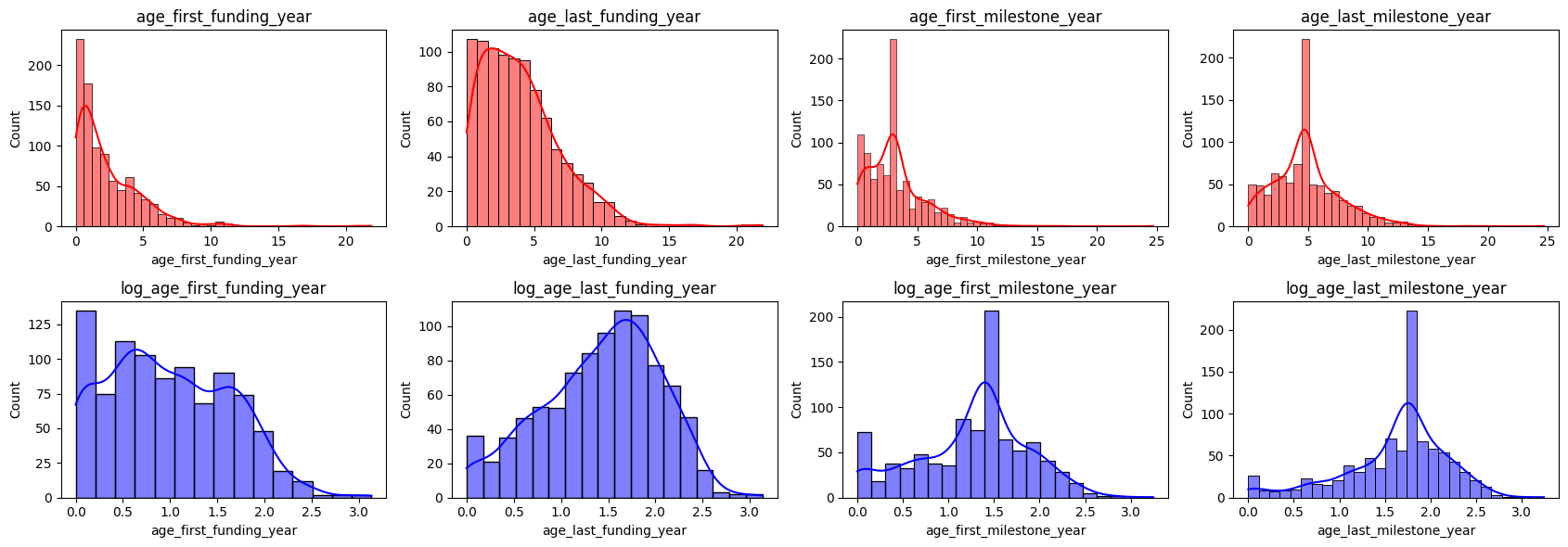
To handle these outliers we will use the log-transformed method that involves taking the logarithm of each data point. It can be helpful when the data has a wide range of values, helping to balance the data.

The following graphs illustrate the dataset before and after applying log transformation:

variables = ["age_first_funding_year", "age_last_funding_year", "age_first_milestone_year", "age_last_milestone_year"]

# Create a figure with a specific size
plt.figure(figsize=(17, 6), dpi=100)

# Loop through the list of variables
for i, variable in enumerate(variables):
    # Regular histogram
    plt.subplot(2, 4, i + 1)
    sns.histplot(dataframe[variable], color="red", kde=True)
    plt.title(variable)

    # Log-transformed histogram
    plt.subplot(2, 4, i + 5)
    log_variable = np.log(dataframe[variable] + 1)  # Adding 1 to avoid log(0)
    sns.histplot(log_variable, color="blue", kde=True)
    plt.title(f"log_{variable}")

plt.tight_layout()
plt.show()

The distinction is evident; in the blue histogram, the peak is noticeably lower than in the red histogram.

The logarithm transformation compresses the outliers closer to the rest of the values. This makes the data distribution look more balanced and symmetrical, similar to a bell curve.

It’s important to note that log transformation doesn’t remove outliers. Instead, it reduces their impact.

Now that we’ve addressed negative values and outliers, let’s quickly inspect the first row of your dataframe after sorting it by index.

dataframe.sort_index().head(2)
state_code city founded_at closed_at first_funding_at last_funding_at age_first_funding_year age_last_funding_year age_first_milestone_year age_last_milestone_year relationships funding_rounds funding_total_usd milestones category_code has_VC has_angel has_roundA has_roundB has_roundC has_roundD avg_participants is_top500 status diff_founded_first_funding diff_founded_last_funding negative_age_first_funding_year negative_age_last_funding_year negative_age_first_milestone_year negative_age_last_milestone_year abs_diff_founded_first_funding abs_diff_founded_last_funding is_outlier
0 CA San Diego 2007-01-01 NaN 2009-04-01 2010-01-01 2.2493 3.0027 4.6685 6.7041 3 3 375000 3 music 0 1 0 0 0 0 1.00 0 acquired 2 3 0 0 0 0 2 3 0
1 CA Los Gatos 2000-01-01 NaN 2005-02-14 2009-12-28 5.1260 9.9973 7.0055 7.0055 9 4 40100000 1 enterprise 1 0 0 1 1 1 4.75 1 acquired 5 9 0 0 0 0 5 9 0

Creating Variables

Another way to make the data more suitable for analysis is to create new variables (features) by transforming the data.

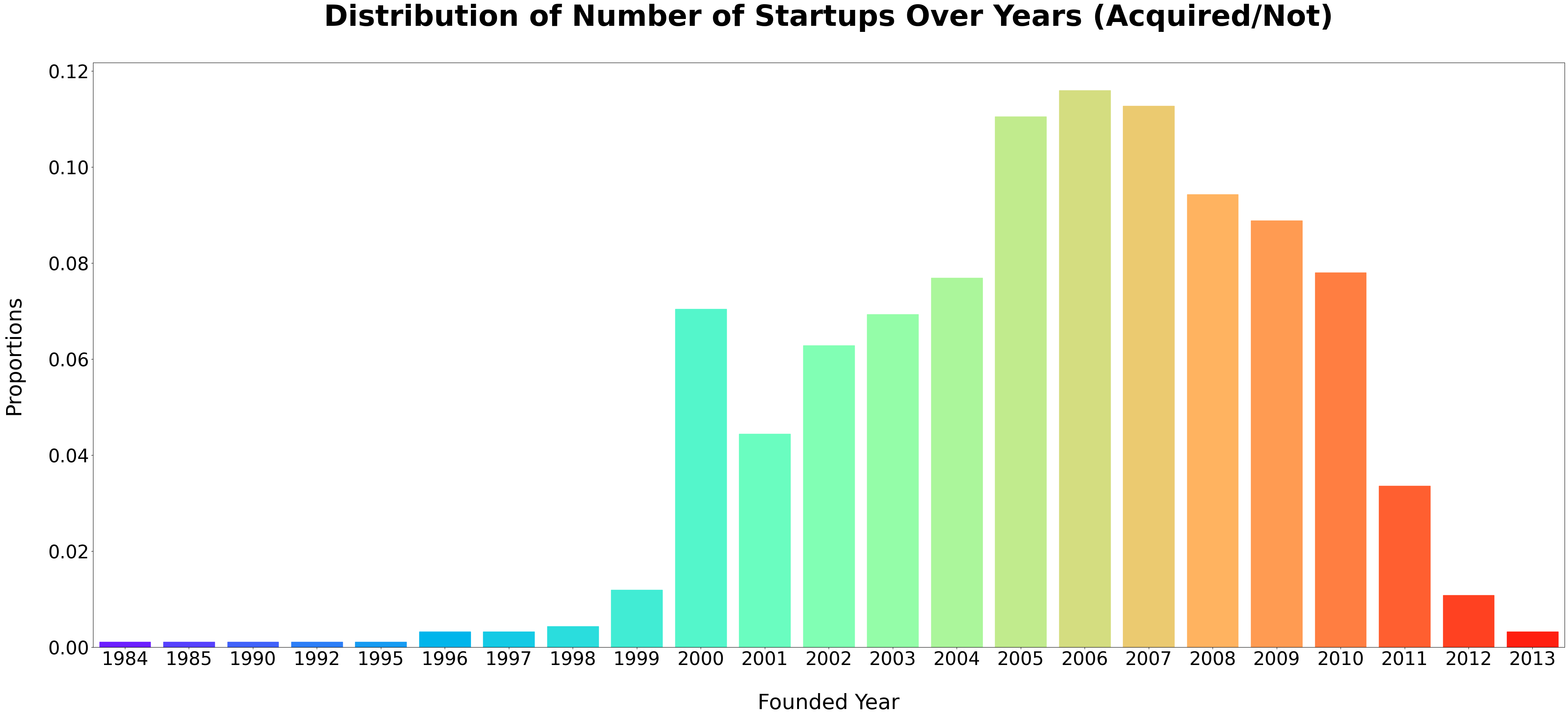
Later in the article, we want to visualize the number of startups created over the years. To achieve this, we will generate founded_year and proportions variables.

#We have excluded the closed_at feature from our data analysis to avoid skewing results with closures. 
#Our focus is on identifying factors that predict a startup's potential for acquisition.
dataframe = dataframe.sort_values(by='closed_at', ascending=False )
dataframe = dataframe.drop(['closed_at'], axis=1).copy()

# Extract and format the year from 'founded_at' as 'founded_year'
dataframe['founded_year'] = dataframe['founded_at'].dt.strftime('%Y')

# Group the DataFrame by 'founded_year' and count occurrences
prop_df = dataframe.groupby('founded_year').size().reset_index(name='counts')

# Calculate the proportions of startups founded each year
prop_df['proportions'] = prop_df['counts'] / prop_df['counts'].sum()

Transforming Categorical into Integers

Just like we did with our target variables previously, let’s apply the mapping technique again to convert the remaining categorical features into numerical ones.

# Selecting key categorical columns for focused analysis or preprocessing allowing for 
# safe experimentation and manipulation.
columns_to_copy = ["status", "state_code", "category_code"]
categorical_data = dataframe[columns_to_copy].copy()

# Mapping categorical columns
categorical_columns = ['state_code', 'city', 'category_code','founded_year','status']
# Dictionary to store mappings
column_mappings = {}

# Create a function to generate mappings
def create_mapping(column):
    unique_values = dataframe[column].unique()
    mapping = {value: i for i, value in enumerate(unique_values)}
    return mapping

# Apply mapping for each categorical column
for column in categorical_columns:
    mapping = create_mapping(column)
    dataframe[column] = dataframe[column].map(mapping)
    # Save mapping in the dictionary
    column_mappings[column] = mapping

# Now, column_mappings contains the desired dictionary structure
print(column_mappings)
{'state_code': {'NY': 0, 'CA': 1, 'PA': 2, 'FL': 3, 'WA': 4, 'GA': 5, 'CT': 6, 'MA': 7, 'NJ': 8, 'IL': 9, 'MI': 10, 'VA': 11, 'AZ': 12, 'OH': 13, 'UT': 14, 'TX': 15, 'DC': 16, 'ME': 17, 'TN': 18, 'ID': 19, 'NC': 20, 'WV': 21, 'MN': 22, 'KY': 23, 'MO': 24, 'CO': 25, 'NM': 26, 'NH': 27, 'NV': 28, 'MD': 29, 'WI': 30, 'OR': 31, 'AR': 32, 'IN': 33, 'RI': 34}, 'city': {'New York': 0, 'San Francisco': 1, 'Allentown': 2, 'Tampa': 3, 'Seattle': 4, 'Los Altos': 5, 'Atlanta': 6, 'Santa Clara': 7, 'Farmington': 8, 'Palo Alto': 9, 'San Jose': 10, 'Menlo Park': 11, 'San Diego': 12, 'Bedford': 13, 'Mountain View': 14, 'Burlingame': 15, 'Princeton': 16, 'Sunnyvale': 17, 'Chicago': 18, 'Hillsborough': 19, 'Bingham Farms': 20, 'Los Angeles': 21, 'Waltham': 22, 'Campbell': 23, 'Charlottesville': 24, 'Warrenville': 25, 'Redwood City': 26, 'Milpitas': 27, 'Tempe': 28, 'New York City': 29, 'Cincinnati': 30, 'Salt Lake City': 31, 'Redmond': 32, 'Yorba Linda': 33, 'Bellevue': 34, 'Pasadena': 35, 'Dallas': 36, 'Evanston': 37, 'Philadelphia': 38, 'Fremont': 39, 'Washington': 40, 'Austin': 41, 'Westport': 42, 'Richardson': 43, 'Santa Barbara': 44, 'Burlington': 45, 'Rye Brook': 46, 'West Newfield': 47, 'NY': 48, 'Pittsburgh': 49, 'Beverly Hills': 50, 'NYC': 51, 'Viena': 52, 'San Mateo': 53, 'Champaign': 54, 'Red Bank': 55, 'Memphis': 56, 'South San Francisco': 57, 'Idaho Falls': 58, 'Pittsboro': 59, 'Alpharetta': 60, 'Hartford': 61, 'Kearneysville': 62, 'Raleigh': 63, 'Zeeland': 64, 'Boston': 65, 'Lawrenceville': 66, 'Canton': 67, 'Cambridge': 68, 'Andover': 69, 'Oakland': 70, 'Toledo': 71, 'Saint Paul': 72, 'Hollywood': 73, 'Chantilly': 74, 'Morgan Hill': 75, 'Reston': 76, 'Boxborough': 77, 'Louisville': 78, 'Duluth': 79, 'Addison': 80, 'Houston': 81, 'Saint Louis': 82, 'Torrance': 83, 'Berkeley': 84, 'Glendale': 85, 'Arlington': 86, 'Avon': 87, 'Albuquerque': 88, 'Vienna': 89, 'Yardley': 90, 'Centennial': 91, 'Columbus': 92, 'San Bruno': 93, 'Golden Valley': 94, 'Plano': 95, 'Cleveland': 96, 'Needham': 97, 'Waco': 98, 'Durham': 99, 'Somerset': 100, 'West Chester': 101, 'Nashua': 102, 'Henderson': 103, 'Woburn': 104, 'Boulder': 105, 'College Park': 106, 'Foster City': 107, 'El Segundo': 108, 'Middleton': 109, 'Tualatin': 110, 'Carlsbad': 111, 'Little Rock': 112, 'Moffett Field': 113, 'The Woodlands': 114, 'Wilmington': 115, 'Loveland': 116, 'Los Gatos': 117, 'Indianapolis': 118, 'Columbia': 119, 'Newport Beach': 120, 'Puyallup': 121, 'Petaluma': 122, 'Playa Vista': 123, 'Englewood': 124, 'Bala Cynwyd': 125, 'Frederick': 126, 'Napa': 127, 'Providence': 128, 'Altamonte Springs': 129, 'Lancaster': 130, 'Weston': 131, 'Bothell': 132, 'Somerville': 133, 'SPOKANE': 134, 'Newton': 135, 'Bloomfield': 136, 'Brooklyn': 137, 'Kenmore': 138, 'Vancouver': 139, 'La Jolla': 140, 'Provo': 141, 'San Franciso': 142, 'Freedom': 143, 'Santa Monica': 144, 'Cupertino': 145, 'San Rafael': 146, 'Williamstown': 147, 'Denver': 148, 'Santa Ana': 149, 'Manchester': 150, 'Aliso Viejo': 151, 'Kansas City': 152, 'Kirkland': 153, 'Alameda': 154, 'Dulles': 155, 'Timonium': 156, 'Sterling': 157, 'Plymouth': 158, 'Conshohocken': 159, 'Longmont': 160, 'Naperville': 161, 'Berwyn': 162, 'Marlborough': 163, 'Monterey Park': 164, 'Bethesda': 165, 'Portland': 166, 'North Billerica': 167, 'Maynard': 168, 'Long Island City': 169, 'Solana Beach': 170, 'NW Atlanta': 171, 'West Hollywood': 172, 'Herndon': 173, 'Paramus': 174, 'Minneapolis': 175, 'Irvine': 176, 'Larkspur': 177, 'McLean': 178, 'Lowell': 179, 'Woodbury': 180, 'Littleton': 181, 'Billerica': 182, 'Broomfield': 183, 'Greenwood Village': 184, 'Itasca': 185, 'Lexington': 186, 'Calabasas': 187, 'North Reading': 188, 'Lindon': 189, 'Bethlehem': 190, 'New Hope': 191, 'North Hollywood': 192, 'Carpinteria': 193, 'Nashville': 194, 'Belmont': 195, 'Chevy Chase': 196, 'Lake Oswego': 197, 'Tewksbury': 198, 'Dedham': 199, 'Jersey City': 200, 'Annapolis': 201, 'Las Vegas': 202, 'Minnetonka': 203, 'Pleasanton': 204, 'Sunnnyvale': 205, 'Brisbane': 206, 'Westford': 207, 'Emeryville': 208, 'Potomac Falls': 209, 'Framingham': 210, 'Laguna Niguel': 211, 'Thousand Oaks': 212, 'Arcadia': 213, 'San Carlos': 214, 'Acton': 215, 'Chelmsford': 216, 'El Segundo,': 217, 'Hampton': 218, 'Scotts Valley': 219, 'Lisle': 220}, 'category_code': {'education': 0, 'ecommerce': 1, 'public_relations': 2, 'software': 3, 'other': 4, 'fashion': 5, 'security': 6, 'semiconductor': 7, 'hardware': 8, 'enterprise': 9, 'messaging': 10, 'web': 11, 'search': 12, 'biotech': 13, 'finance': 14, 'cleantech': 15, 'network_hosting': 16, 'mobile': 17, 'analytics': 18, 'advertising': 19, 'photo_video': 20, 'manufacturing': 21, 'social': 22, 'medical': 23, 'games_video': 24, 'news': 25, 'real_estate': 26, 'consulting': 27, 'travel': 28, 'automotive': 29, 'music': 30, 'hospitality': 31, 'transportation': 32, 'sports': 33, 'health': 34}, 'founded_year': {'2010': 0, '2011': 1, '2000': 2, '2006': 3, '2004': 4, '2009': 5, '2003': 6, '2002': 7, '2005': 8, '2001': 9, '2007': 10, '1997': 11, '2008': 12, '1996': 13, '2012': 14, '1998': 15, '1999': 16, '1995': 17, '2013': 18, '1985': 19, '1984': 20, '1992': 21, '1990': 22}, 'status': {'closed': 0, 'acquired': 1}}

We proceed with converting the datetime features to numerical values by transforming each specified column into days.

# Set a reference date. You could choose the earliest date in your dataset or a specific date.
reference_date = dataframe[['founded_at', 'first_funding_at', 'last_funding_at']].min().min()

# List of columns to convert
columns_to_convert = ['founded_at', 'first_funding_at', 'last_funding_at']

# Convert each specified column into days since the reference date
for column in columns_to_convert:
    dataframe[f'{column}_days'] = (dataframe[column] - reference_date).dt.days

# Optionally, you might drop the original datetime columns if they're not needed anymore.
dataframe.drop(['founded_at', 'first_funding_at', 'last_funding_at'], axis=1, inplace=True)

Pre-processing Summary

Let’s recap the steps we have performed to improve data quality:

  • Filtering irrelevant values: We simplified the dataframe by reducing the number of variables from 50 to 24, removing unnecessary ones.
  • Handling missing values: Identified and handled missing values through imputation techniques.
  • Addressing negative values: We used Box Plot and Scatter Plot methods to detect negative values and then handled them with the np.abs() function.
  • Managing Outliers: We detected outliers with histograms and addressed them using the log-transformed technique.
  • Created new features: From existing ones, we generate and transform variables like age and the number of startups created each year.
  • Conversion of non-numeric data: Converted the text data to numbers to be able to analyze them.

Now that we’re done with data cleaning and feature engineering, we can proceed to the most exciting part: extracting some insights!

Data Analysis

Top 10 Sectors with High Startup Acquisition Rates

%matplotlib inline

# Getting the order of categories based on their frequency
# (now for y-axis since we are doing a horizontal bar plot)
order = categorical_data["category_code"].value_counts().index[:10]

# Create the countplot with horizontal bars
plt.figure(figsize=(18, 9), dpi=300)

# Specify the hue order explicitly
ax = sns.countplot(
    y="category_code", data=categorical_data, order=order, palette="pastel",
    hue='status', hue_order=['acquired', 'closed']
)

plt.title("Top 10 Industries Where Startups Are Frequently Acquired", fontsize=22, pad=20, fontweight='bold')
plt.xlabel("Number of Startups",fontsize=17)
plt.ylabel("Category Code", fontsize=17)
plt.legend(title='Status', bbox_to_anchor=(1.05, 1), loc='upper left', fontsize=16)

# Set the font size of the category labels using tick_params
ax.tick_params(axis='y', labelsize=14) 

# Iterate through the patches (bars) and add text
for bar in ax.patches:
    # Get the position and width of the bar
    bar_y = bar.get_y() + bar.get_height() / 2  # Y-coordinate of the center of the bar
    bar_width = bar.get_width()  # Width of the bar (count value)

    # Add text to the right end of the bar
    ax.text(bar_width, bar_y, f'{int(bar_width)}', 
            fontsize=12, color='black', ha='left', va='center')

plt.tight_layout()  # Adjust layout to ensure everything fits without overlapping
plt.show()

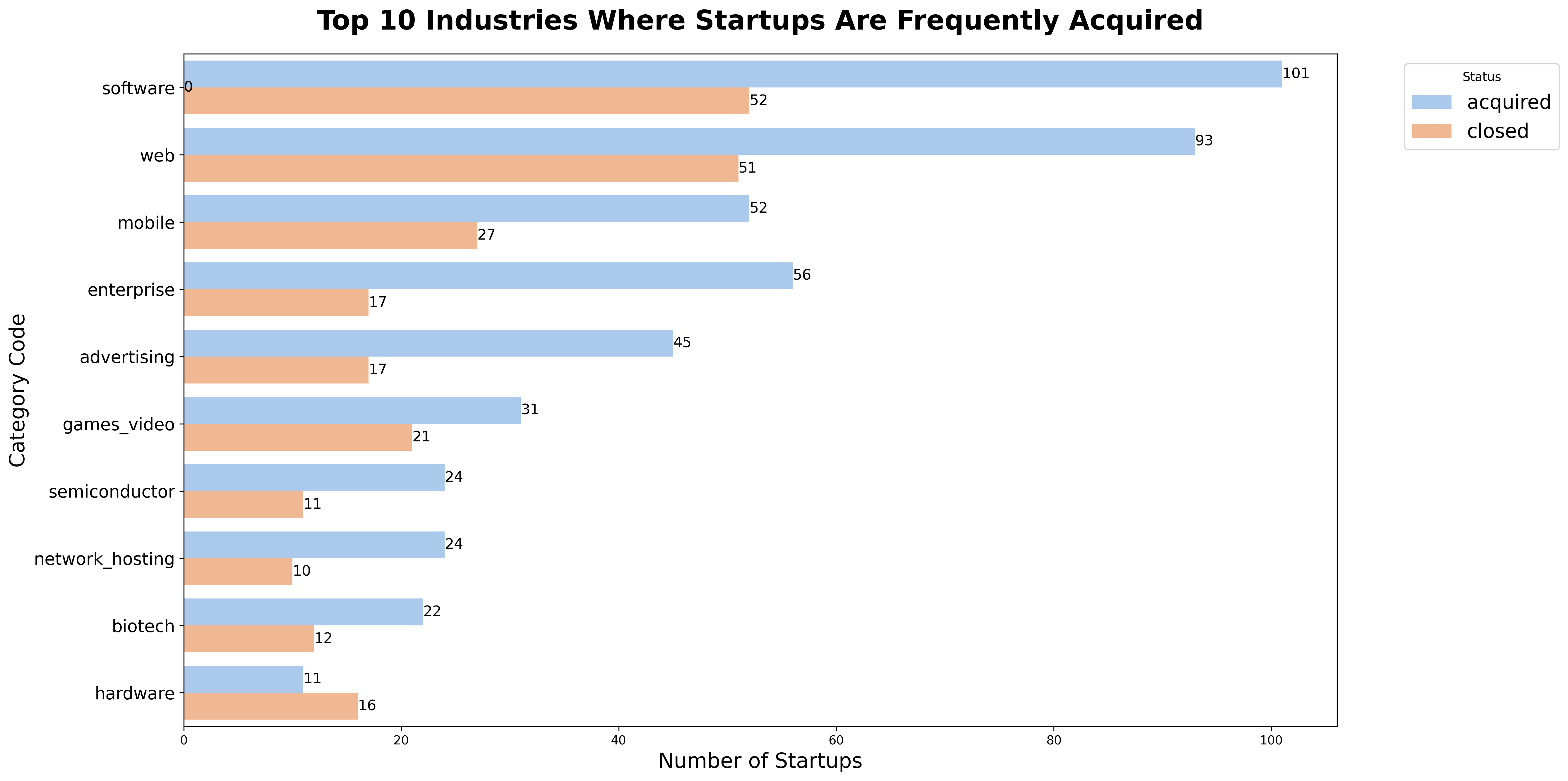
As observed in the bar chart, we identify that:

  • The software industry has the highest number of startups and sees a significant portion of these ventures being acquired by larger entities.
  • This trend highlights how the software industry’s constant innovation and growth attract big companies interested in new technologies or looking to grow their tech capabilities.
  • Similarly, the web and mobile sectors emerge as vibrant ecosystems, containing many startups.

Our next step is to examine time’s influence on startup acquisitions.

Year of the Highest Number of Startups Founded

fig, ax = plt.subplots(figsize=(50, 20))
# Adjust the font size as needed
ax.tick_params(axis='x', labelsize=35)  

# Optionally, change the font size of the tick labels on the y-axis as well
ax.tick_params(axis='y', labelsize=35) 

ax.set_xlabel('Founded Year', fontsize=40,labelpad=45) 
ax.set_ylabel('Proportions', fontsize=40, labelpad=45)  
# Create a barplot without a hue parameter
barplot = sns.barplot(data=prop_df, x='founded_year', y='proportions')

# Manually set colors for each bar if you want them to be different
colors = sns.color_palette("rainbow", n_colors=len(prop_df['founded_year']))
for i, bar in enumerate(barplot.patches):
    bar.set_color(colors[i % len(colors)])

plt.title('Distribution of Number of Startups Over Years (Acquired/Not)',fontsize=55, pad=70, fontweight='bold')
plt.show()

Based on the visualization, we identify the following:

  • Looking at the history of startups, we see a significant increase in activity until 2007, indicating an era of rapid growth. The rise in startup activity during this period is probably connected to the rise of the internet and digital technologies.
  • Following the year 2007, the market experienced a significant decline. Several factors could have caused it. One of the possible reasons could have been the worldwide financial crisis that occurred around that time, market saturation, or changes in how investors act.

Let’s go ahead to explore how location influences startup success.

Startup Acquisitions Across U.S. States

# Create the stacked bar chart
import matplotlib.pyplot as plt

grouped_data = categorical_data.groupby(['state_code', 'status']).size().unstack().fillna(0)

# Sort the DataFrame by the sum of 'acquired' and 'closed' for each state and take the first 10
grouped_data = grouped_data.sort_values(by=['acquired', 'closed'], ascending=False).head(10)

# Convert the index to string to ensure proper handling as categorical data
grouped_data.index = grouped_data.index.astype(str)

ax = grouped_data.plot(kind='bar', stacked=True, figsize=(15, 8), color=['skyblue', 'salmon'])
plt.title('Number of Acquired vs. Closed Startups in Top 10 States',fontsize=20, pad=25, fontweight='bold')
plt.xlabel('State Code', fontsize=18,labelpad=10)
plt.ylabel('Number of Startups', fontsize=18,labelpad=20)
plt.xticks(rotation=45)  # Rotates the state labels for better readability
plt.legend(title='Status')

threshold = 50 

# Add text annotations
for i, (state_code, row) in enumerate(grouped_data.iterrows()):
    cumulative_height = 0
    for status in ['acquired', 'closed']:  # Iterate in a specific order
        count = row[status]
        # Display annotation only if count is above the threshold
        if count > threshold:
            # Position text at the center of each segment
            ax.text(i, cumulative_height + count / 2, f'{int(count):,}', 
                    fontsize=8, color='black', ha='center', va='center')
        cumulative_height += count

# Slightly adjust the ylim to make room for text annotations
ax.set_ylim(0, grouped_data.max().sum() * 1.1)  
plt.show()

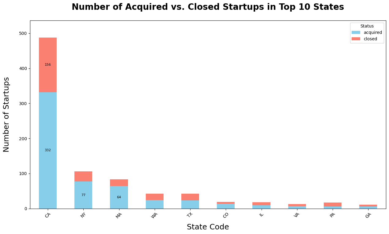
The bar chart shows the following location trends:

  • California (CA) stands out with the highest number of startups, where the number of acquired startups is more than double the number closed.
  • New York (NY) and Massachusetts (MA) also exhibit a pattern where more startups are being acquired than closed, suggesting a favorable startup environment in these states.
  • In other states such as Washington (WA), Texas (TX), and Colorado (CO), the number of acquisitions and closures are closer, pointing to a more challenging location.

Factors Correlated with Startup Acquisitions

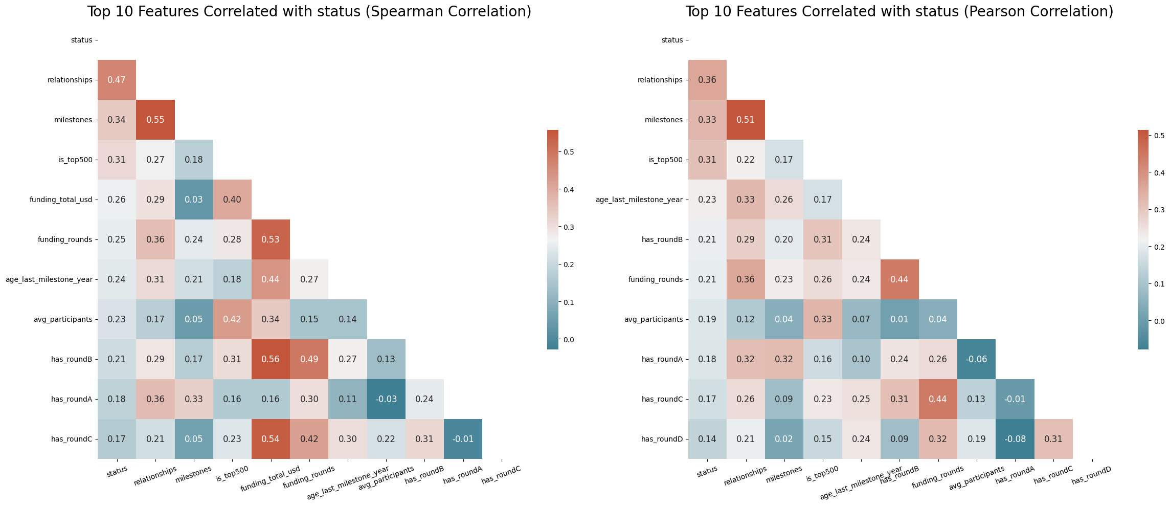
We can use a correlation heatmap to identify the variables strongly correlated with the startup success rate.

We will compare two correlation methods - Pearson’s and Spearman’s - to analyze the features with absolute correlation values.

def draw_heatmaps_side_by_side(data_df, target='status'):
    # Ensure target is in DataFra
    if target not in data_df.columns:
        raise ValueError(f"Target '{target}' not found in DataFrame columns.")
    
    # Function to calculate and return top correlated features' correlation matrix
    def get_top_correlations(data_df, method):
        corr = data_df.corr(method=method)
        top_features = corr[target].abs().sort_values(ascending=False).head(11).index
        return corr.loc[top_features, top_features]
    
    # Calculate correlation matrices
    top_spearman_corr = get_top_correlations(data_df, 'spearman')
    top_pearson_corr = get_top_correlations(data_df, 'pearson')
    
    # Setup for dual heatmaps
    fig, axes = plt.subplots(1, 2, figsize=(24, 10))  
    cmap = sns.diverging_palette(220, 20, as_cmap=True)  # Diverging color map
    
    # Draw heatmaps
    for ax, corr, title in zip(axes, [top_spearman_corr, top_pearson_corr], 
                               ['Spearman Correlation', 'Pearson Correlation']):
        sns.heatmap(corr, ax=ax, cmap=cmap, annot=True, fmt=".2f", annot_kws={"size": 12},
                    cbar_kws={"shrink": .5}, mask=np.triu(np.ones_like(corr, dtype=bool)))
        ax.set_title(f'Top 10 Features Correlated with {target} ({title})', fontsize=20)
        ax.tick_params(axis='y', rotation=0)
        ax.tick_params(axis='x', rotation=20)
    
    plt.tight_layout()
    plt.show()

numerics = ['int16', 'int32', 'int64', 'float16', 'float32', 'float64','datetime64']
numerical_df_1 = dataframe.select_dtypes(include=numerics)

draw_heatmaps_side_by_side(numerical_df_1)

Based on the heatmaps comparing Spearman and Pearson correlation coefficients for top features correlated with startup status, we can conclude:

  • relationships: The number of partnerships a startup forms has a notable correlation with its outcomes, with Spearman factor at 0.47 and Pearson at 0.36. Strong business relationships can be an important factor in the growth and success of a startup.
  • milestones: When a startup achieves significant objectives, it tends to have a more favorable outcome. The numbers show a strong correlation: 0.34 in Spearman’s and 0.33 in Pearson’s analysis, indicating that reaching milestones is a common characteristic of startups with positive results.
  • funding_rounds: The total amount of funding a startup receives is also connected to its outcomes. The data shows a Spearman correlation of 0.25 and a Pearson correlation of 0.21. This suggests that the more funding a startup has, the more likely it is to succeed.

Impact of Milestone Achievement on Startup Acquisitions

# Group your data by milestones and status and count the occurrences
grouped = dataframe.groupby(["milestones", "status"]).size().reset_index(name="count")
grouped.columns = ["source", "target", "value"]
grouped['target'] = grouped['target'].map({0: 'closed', 1: 'acquired'})
grouped['source'] = grouped.source.map({0: '0', 1: '1', 2: '2', 3: '3', 4: '4', 5: '5', 6: '6', 8: '8'})
links = pd.concat([grouped], axis=0)
unique_source_target = list(pd.unique(links[['source', 'target']].values.ravel('K')))
mapping_dict = {k: v for v, k in enumerate(unique_source_target)}
links['source'] = links['source'].map(mapping_dict)
links['target'] = links['target'].map(mapping_dict)

# Convert links DataFrame to dictionary
links_dict = links.to_dict(orient='list')

# Apply the color map to the links
# Directly use the 'acquired' and 'closed' labels to determine the color
link_colors = ['rgba(144, 238, 144, 0.5)' if target == 'acquired' else 'rgba(255, 0, 0, 0.5)' for target in grouped['target']]


fig = go.Figure(data=[go.Sankey(
    node=dict(
        pad=15,
        thickness=20,
        line=dict(color="black", width=0.5),
        label=unique_source_target,
        color="white"
    ),
    link=dict(
        source=links_dict["source"],
        target=links_dict["target"],
        value=links_dict["value"],
        color=link_colors  # Apply the colors to the links
    )
)])

fig.update_layout(
    annotations=[
        dict(
            x=0.5,  # Set x to 0.5 for centering horizontally
            y=1.20,  # Adjust y as needed 
            text="Analyzing the Correlation: Milestones Achievement vs Startup Status",
            showarrow=False,
            font=dict(
                size=18,
                family="Arial, sans-serif"  
            ),
            textangle=0,  
            xref="paper",
            yref="paper"
        ),
        # Add a comma here after the closing brace of the first dictionary
        dict(
            x=-0.10,  # Position to the left of the diagram
            y=0.5,    # Vertically centered
            text="Milestones Achievement",  # Text for the left side
            showarrow=False,
            font=dict(size=15),
            textangle=-90,  
            xref="paper",
            yref="paper"
        ),
        dict(
            x=1.05,  # Position to the right of the diagram
            y=0.5,   
            text="Startup Status",  # Text for the right side
            showarrow=False,
            font=dict(size=15),
            textangle=-90,  
            xref="paper",
            yref="paper"
        )
    ]
)

fig.show()

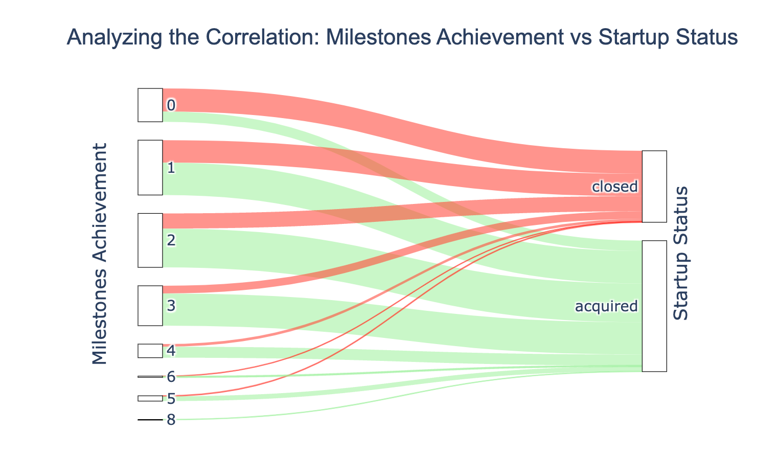
The Sankey diagram indicates that Startups reaching 1 to 4 milestones have a higher chance of being acquired.

This highlights the importance of validating a startup’s business model and execution capabilities in the early stages. Startups can minimize the risk of closure by setting and achieving initial milestones.

Let’s now turn our attention to the types of investment.

Impact of Round Funding on Startup Acquisitions

# Filter the DataFrame for entries with a status of 1
d = dataframe.loc[dataframe['status'] == 1]

# Select only the relevant binary columns
f = d[["has_VC", "has_angel", "has_roundA", "has_roundB", "has_roundC", "has_roundD"]]

# Melt the DataFrame to long format for use with countplot
melted_f = pd.melt(f)

# Map the binary values to strings
melted_f['value'] = melted_f['value'].map({1: 'acquired', 0: 'closed'})

# Create the countplot with horizontal bars
fig, ax = plt.subplots(figsize=(10, 6))  # Adjust the figure size as needed
sns.countplot(data=melted_f, y='variable', hue='value', orient='h', palette="rainbow")

# Update the y-axis label with adjusted position
ax.set_ylabel("Investment Types", labelpad=20)  # Adjust labelpad for position
ax.set_xlabel("Startup Count", fontsize=10, labelpad=25)

# Create the title manually and adjust its position
ax.text(0.2, 1.05, "Investment Types for Acquired Startups", fontsize=15, transform=ax.transAxes, fontweight='bold')  # Adjust the x and y values

# Update the legend
handles, labels = ax.get_legend_handles_labels()
ax.legend(handles, ['Acquired','Closed'], title='Status')

plt.show()

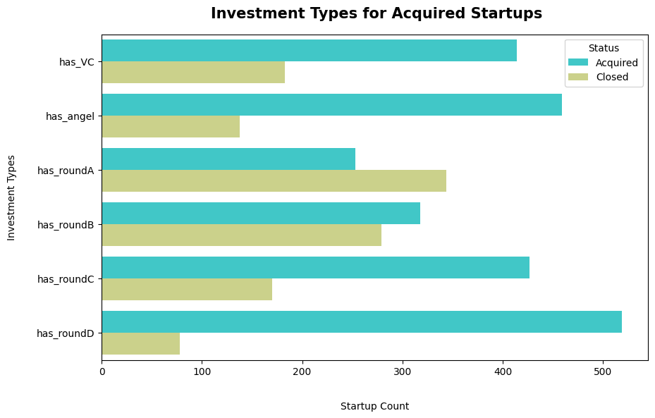
Based on the data provided, startups that have gone through multiple rounds of funding (from angel investments to rounds A, B, C, and D) do show a higher likelihood of being acquired.

Startups that go through more rounds of funding, especially those that secure venture capital or angel investment, are more likely to be acquired than to close down. This could mean that the more confidence investors have in a startup (as shown by continued funding), the greater the startup’s chances of success.

Each successful funding round may indicate that the startup is meeting milestones and scaling effectively, which can make it a more attractive target for acquisition.

Average Funding for Acquired vs. Closed Startups

import pandas as pd
import plotly.express as px

# Assuming 'dataframe' is defined elsewhere and has the column 'funding_total_usd' and 'status'

# Filter out extreme outliers from the data
max_value = dataframe['funding_total_usd'].quantile(0.99)
filtered_data = dataframe.loc[dataframe['funding_total_usd'] < max_value].copy()  # Ensure a copy is made

# Map the status values
status_mapping = {1: 'Acquired', 0: 'Closed'}
filtered_data['status'] = filtered_data['status'].map(status_mapping)

# Define the colors for the histogram
colors = ['#1f77b4', '#d62728']

# Create a histogram with the filtered data
fig = px.histogram(data_frame=filtered_data, x='funding_total_usd', color='status',
                   labels={'funding_total_usd': 'Total Funding (USD in Millions)'},
                   color_discrete_sequence=colors)

# Update layout for better visualization
fig.update_layout(
    title={
        'text': 'Distribution of Total Funding: Acquired vs Closed Startups',
        'y': 0.95,
        'x': 0.5,
        'xanchor': 'center',
        'yanchor': 'top',
        'font': {
            'size': 17,
            'color': 'black',
            'family': 'Arial, sans-serif'
        },
    },
    xaxis_title='Total Funding (USD in Millions)',
    yaxis_title='Frequency',
)

# Format the x-axis tick labels to display values in millions
fig.update_xaxes(tickformat=".2s", exponentformat="none")

# Show the figure
fig.show()

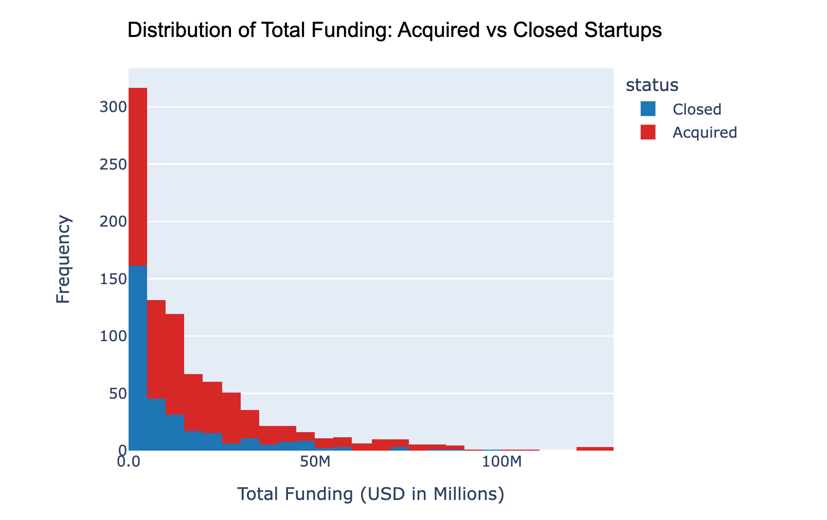
The funding is shown in U.S. dollars, ranging from 0 to over 120 million.

Here are the main insights from this visualization:

  • Most acquired and closed startups have received funding of 20 million U.S. dollars or less.
  • Startups that closed tend to have a higher frequency in the lower funding brackets (below 20 million USD) compared to those acquired.
  • As the amount of funding increases, the number of closed startups decreases more rapidly than that of acquired startups.
  • Very few startups, whether acquired or closed, have funding above 60 million USD.

Data suggests that having less funding is more common among startups that eventually close. Meanwhile, those that get acquired show a wider range of funding, including higher amounts.

Data-driven conclusions

Data pre-processing was key in turning raw information into practical insights. Steps such as imputation techniques, identifying negative and missing values, and carefully addressing outliers, helped prepare the data for accurate analysis.

Visual data representations allowed us to quickly discover complex relationships, notice patterns, and interpret data.

After an in-depth data analysis, we identified several important factors that can help a startup increase its chances of being bought by another company:

  • Amount of funding: Startups that receive multiple funding rounds, especially those with significant investments from venture capital or angel investors, are more likely to be bought. Diversifying investment sources can ensure more stable and sustained growth.
  • Achieving milestones: To be successful, a startup must validate its business model and execution capabilities in the early stages. Milestones provide a clear roadmap for achievements. They help prioritize tasks, guide daily operations, and keep the team focused on short-term and long-term goals.
  • Relationships: Investors, mentors, and other industry professionals can help startups gain valuable insights. Relationships and funding are directly correlated. Solid connections increase the likelihood of more funding, valuable advice, and ultimately, to be acquired.

Even if these success factors may be familiar, it is always important to validate assumptions through analysis. After all, it has been proven that data-driven decisions lead to better results.


Stay in touch

I hope you enjoyed this article as much as I enjoyed writing it!
Feel free to support my work by interacting with me on LinkedIn 👀

Subscribe to get the latest articles from my blog delivered straight to your inbox!


About the author

Gabriela Arzate

ML Technical Writer

I’m a technical writer with a keen interest in Machine Learning. I write detailed, easy-to-understand articles to help you in your ML journey. I'm excited to share my discoveries and what inspires me in ML with you.